import pandas as pdimport plotly.express as pximport plotly.io as piopio.renderers.default ="vscode"from pyspark.sql import SparkSessionfrom pyspark.sql.functions import split, explode, col, regexp_replace, transform, isnanspark = SparkSession.builder.appName("LightcastCleanedData").getOrCreate()# reload cleaned datadf_cleaned = spark.read.option("header", "true").option("inferSchema", "true").option("multiLine","true").csv("data/lightcast_cleaned.csv")# show datasetdf_cleaned.show(5)
Creating a team-based skills data framework
We take a column of software skill names from the cleaned dataset, splits each entry, cleans up the text, and counts how often each skill appears. Then, we grabs the top 30 most frequent skills, and puts them into a tidy table using pandas to make it easier to view.
Code
from collections import Counterimport pandas as pd# 1. Extracting data with .collect()skills_rows = df_cleaned.select("SOFTWARE_SKILLS_NAME").dropna().collect()# 2. Split each line of string into a list of skills and expand the statisticsall_skills = []for row in skills_rows: skills = row["SOFTWARE_SKILLS_NAME"] ifisinstance(skills, str): skill_list = [s.strip() for s in skills.split(",")] # Split and remove spaces all_skills.extend(skill_list)# 3. Counting word frequencyskill_counts = Counter(all_skills)top_skills = skill_counts.most_common(30) # 4. Change to dataframe and showdf_skill_counts = pd.DataFrame(top_skills, columns=["Skill", "Frequency"])#print(df_skill_counts)
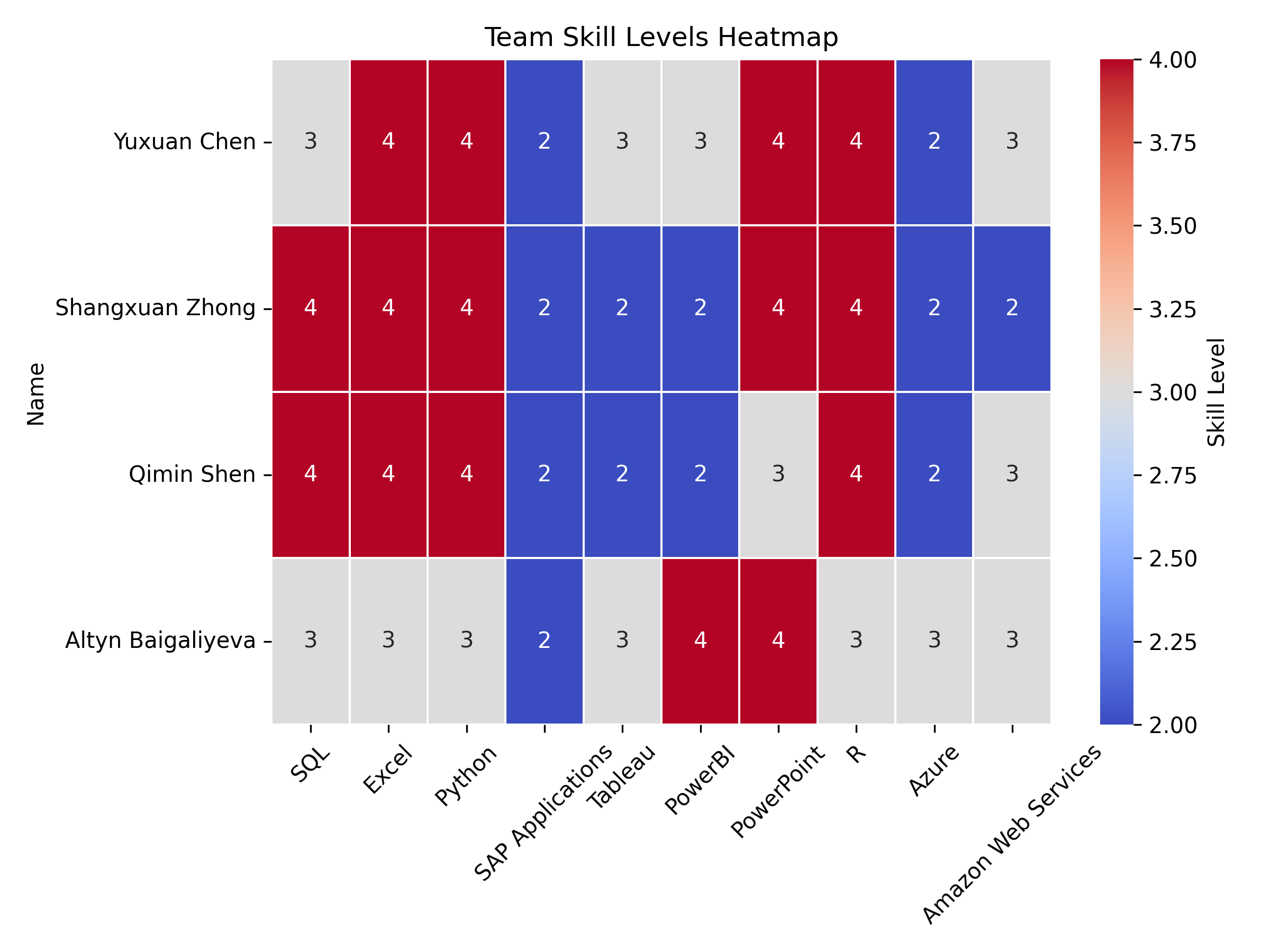
We build a table showing the skill levels of our team members across various tools like SQL, Excel, Python, and others. Then we create a heatmap to visually highlight each person’s strengths and weaknesses, making it easy to compare skill levels across the team.
Code
import pandas as pdimport seaborn as snsimport matplotlib.pyplot as plt# 1. Construct team skill level dataskills_data = {"Name": ["Yuxuan Chen", "Shangxuan Zhong", "Qimin Shen", "Altyn Baigaliyeva"],"SQL": [3, 4, 4, 3],"Excel": [4, 4, 4, 3],"Python": [4, 4, 4, 3],"SAP Applications": [2, 2, 2, 2],"Tableau": [3, 2, 2, 3],"PowerBI": [3, 2, 2, 4],"PowerPoint": [4, 4, 3, 4],"R": [4, 4, 4, 3],"Azure": [2, 2, 2, 3],"Amazon Web Services": [3, 2, 3, 3]}# 2. Create dataframe and set Name as indexdf_skills = pd.DataFrame(skills_data)df_skills.set_index("Name", inplace=True)# 3. Demonstrate the skill level chart#print("Team Skill Rating Scale:")#display(df_skills) # 4. Visualize the skills gap by heat mapplt.figure(figsize=(8, 6))sns.heatmap(df_skills, annot=True, cmap="coolwarm", linewidths=0.5, cbar_kws={'label': 'Skill Level'})plt.title("Team Skill Levels Heatmap")plt.xticks(rotation=45) plt.yticks(rotation=0)plt.tight_layout()plt.savefig("images/Skill_Level.png", dpi=300)plt.show()
Team strengths and gaps
Based on the heatmap, we can see that our team displays varied skill levels across multiple technical domains. The strongest skills across the team are SQL, Excel, Python, PowerBI, and R, where most members show advanced (level 4) proficiency. While SAP Applications and Azure are consistently lower across all team members, with most showing only basic knowledge (level 2).
Three team members (Yuxuan Chen, Shangxuan Zhong, and Qimin Shen) demonstrate particularly strong data-related skills, with advanced proficiency in multiple areas. Altyn Baigaliyeva has a different skill distribution, showing strength in PowerBI and PowerPoint while maintaining intermediate skills in most other areas.
Compare team skills to industry requirements
We add a new column EDU_MATCH to the dataset to check if each person’s actual education level matches the minimum education requirement. If they match, it labels the row as “Match”; otherwise, it marks it as “Mismatch.” We found that the two groups were identical, so we used the data from one of them.
Code
from pyspark.sql.functions import col, when# Create a new column EDU_MATCH, mark it as a match or notdf_compare = df_cleaned.withColumn("EDU_MATCH", when(col("MIN_EDULEVELS") == col("EDUCATION_LEVELS"), "Match").otherwise("Mismatch"))#df_compare.select("MIN_EDULEVELS", "EDUCATION_LEVELS", "EDU_MATCH").show(truncate=False)# Counting mismatched rows#unmatched_count = df_cleaned.filter(col("MIN_EDULEVELS") != col("EDUCATION_LEVELS")).count()#print(f"Not Match:{unmatched_count}")
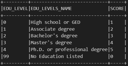
Then we create a reference table that links each unique minimum education level required for a job to a corresponding score. It assigns higher scores to higher education levels, for example, a Ph.D. gets a 5, a Master’s a 4, and so on, down to 0 for jobs that list no education requirement. And we think this scoring helps quantify and compare job expectations based on the level of education required.
Code
from pyspark.sql.functions import when, lit, col, trim# Score tablejob_expectation = df_cleaned.select( col("MIN_EDULEVELS").alias("EDU_LEVEL"), col("MIN_EDULEVELS_NAME").alias("EDU_LEVELS_NAME")).distinct().orderBy(col("EDU_LEVEL").asc())job_expectation = job_expectation.withColumn("SCORE", when(col("EDU_LEVEL") ==4, lit(5)) # Ph.D. or professional degree .when(col("EDU_LEVEL") ==3, lit(4)) # Master's degree .when(col("EDU_LEVEL") ==2, lit(3)) # Bachelor's degree .when(col("EDU_LEVEL") ==1, lit(2)) # Associate degree .when(col("EDU_LEVEL") ==0, lit(1)) # High school or GED .when(col("EDU_LEVEL") ==99, lit(0)) # No Education Listed)job_expectation.show(truncate=False)
Job Expectation
We analyze how often each software skill appears in job listings, categorized by the required education level (which we previously converted into scores). First, we join the education score to each job, split the combined skill strings into individual skills, and count how frequently each skill appears at each education score level. Second, we reshape the data so that each skill shows the number of times it appears across all score levels. Finally, we identify the most common score for each skill. If multiple scores tie for the highest count, we will select the lowest one among them—resulting in a “Proficiency_Levels” value that reflects the typical education requirement associated with that skill in the job market.
Code
from pyspark.sql.functions import count, array, struct, sort_array, expr, size, element_at, col, lit, greatest, when# 1. Export the data df_with_score = df_cleaned.join( job_expectation.select("EDU_LEVEL", "SCORE"), df_cleaned["MIN_EDULEVELS"] == job_expectation["EDU_LEVEL"], how="left")df_with_skills = df_with_score.withColumn("Skill", split(col("SOFTWARE_SKILLS_NAME"), ","))df_exploded = df_with_skills.select(explode("Skill").alias("Skill"), col("SCORE"))df_exploded = df_exploded.withColumn("Skill", trim(col("Skill")))# 2. Frequency Statistics by Skill and SCOREskill_score_counts = df_exploded.groupBy("Skill", "SCORE").agg(count("*").alias("count"))# 3 Expand pivot to columnfrom pyspark.sql.functions importsumas _sumskill_score_pivot = skill_score_counts.groupBy("Skill") \ .pivot("SCORE", [5, 4, 3, 2, 1, 0]) \ .agg(_sum("count")) \ .na.fill(0) # 4. Arrays and filters are used to process tied maxima and find the middle scorescore_structs = array( struct(lit(5).alias("score"), col("5").alias("cnt")), struct(lit(4).alias("score"), col("4").alias("cnt")), struct(lit(3).alias("score"), col("3").alias("cnt")), struct(lit(2).alias("score"), col("2").alias("cnt")), struct(lit(1).alias("score"), col("1").alias("cnt")), struct(lit(0).alias("score"), col("0").alias("cnt")))skill_score_labeled = skill_score_pivot.withColumn("score_array", score_structs) \ .withColumn("max_count", greatest(col("5"), col("4"), col("3"), col("2"), col("1"), col("0"))) \ .withColumn("filtered", expr("filter(score_array, x -> x.cnt = max_count)")) \ .withColumn("Proficiency_Levels", expr("aggregate(filtered, -1, (acc, x) -> IF(acc = -1 OR x.score < acc, x.score, acc))"))# 5. Show final results#skill_score_labeled.select("Skill", "5", "4", "3", "2", "1", "0", "Proficiency_Levels").orderBy("Proficiency_Levels", ascending=False).show(truncate=False)
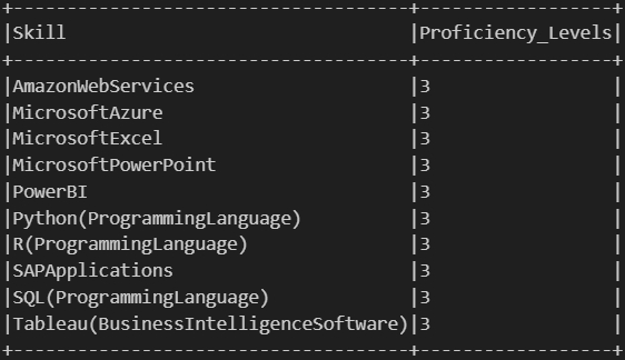
Here we focus on a specific set of software skills that are relevant to our analysis. First, we define a list of target skills we’re interested in, such as SQL, Excel, Python, Tableau, and others. Then, we filter our previously processed skill data to only include these selected skills, keeping just the skill names and their associated “Proficiency_Levels”. Finally, we sort the result alphabetically by skill name to make it easier to review and compare.
Code
from pyspark.sql.functions import lit# 1. Define a list of target skillstarget_skills = ["SQL(ProgrammingLanguage)", "MicrosoftExcel", "Python(ProgrammingLanguage)","SAPApplications", "Tableau(BusinessIntelligenceSoftware)","PowerBI", "MicrosoftPowerPoint", "R(ProgrammingLanguage)","MicrosoftAzure", "AmazonWebServices"]# 2. Filter target skills from skill_score_labeledfiltered_skills = skill_score_labeled.filter(col("Skill").isin(target_skills)) \ .select("Skill", "Proficiency_Levels") \ .orderBy("Skill")# 3. Show resultsfiltered_skills.show(truncate=False)
Filtered Skills
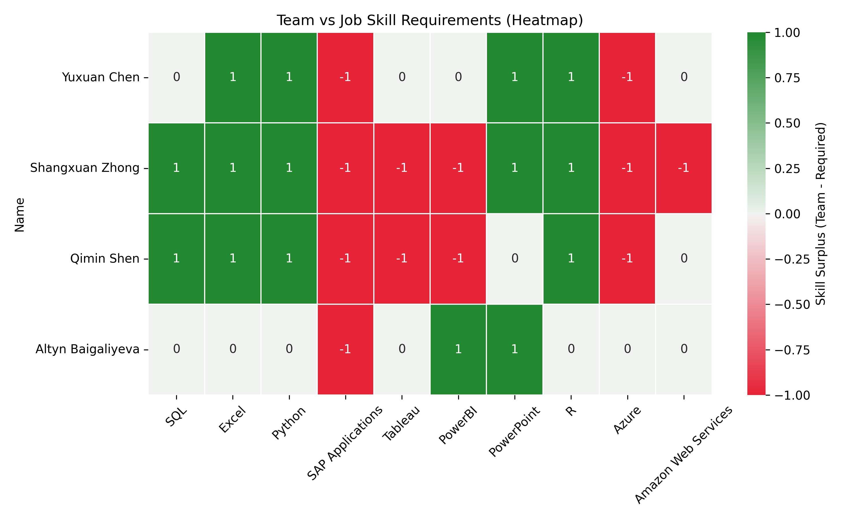
Now we are able to evaluate how well our team’s skill levels match up with job market expectations. First, we collect the proficiency scores for a set of target skills from our previous results. Then, we rename the skill labels into a more readable and consistent format for easier comparison. Next, we calculate the skill gap for each team member by subtracting the job-required score from their actual skill level. Here, positive values mean the team exceeds the requirement, while negative values show areas for improvement. Finally, we visualize these gaps using a heatmap, making it easy to spot which skills are strong and which need development across the team.
Code
import pandas as pdimport matplotlib.pyplot as pltimport seaborn as sns# 1. Build a dictionary of required_levels from filtered_skills with collectrows = filtered_skills.collect()# 2. Mapping skill names to a consistent form used by the teamskill_name_map = {"SQL(ProgrammingLanguage)": "SQL","MicrosoftExcel": "Excel","Python(ProgrammingLanguage)": "Python","SAPApplications": "SAP Applications","Tableau(BusinessIntelligenceSoftware)": "Tableau","PowerBI": "PowerBI","MicrosoftPowerPoint": "PowerPoint","R(ProgrammingLanguage)": "R","MicrosoftAzure": "Azure","AmazonWebServices": "Amazon Web Services"}# 3. Construction of required_levelsrequired_levels = { skill_name_map.get(row["Skill"], row["Skill"]): row["Proficiency_Levels"]for row in rows}# 4. Calculation of gaps (team skills - job requirements)df_gap = df_skills.copy()for skill in df_gap.columns: required = required_levels.get(skill, 0) df_gap[skill] = df_gap[skill] - required# 5. Show result with heat mapplt.figure(figsize=(10, 6))sns.heatmap( df_gap, annot=True, cmap=sns.diverging_palette(10, 130, s=90, l=50, as_cmap=True), # red = insufficient, green = exceeding center=0, linewidths=0.5, cbar_kws={'label': 'Skill Surplus (Team - Required)'})plt.title("Team vs Job Skill Requirements (Heatmap)")plt.xticks(rotation=45)plt.yticks(rotation=0)plt.tight_layout()plt.savefig("images/Gaps_Between.png", dpi=300)plt.show()
Gaps between team skill levels and job expectations
Based on this heatmap, each team member should prioritize different skills to meet market requirements. Yuxuan Chen should focus on improving SAP Applications and Azure skills, which show a -1 deficit. Shangxuan Zhong has many skill gaps, needing development in SAP Applications, Tableau, PowerBI, Azure, and AWS. Qimin Shen similarly needs to improve SAP Applications, Tableau, PowerBI, and Azure. Altyn Baigaliyeva primarily needs to strengthen SAP Applications skills (Quan and Raheem (2023)).
We have searched some information. For SAP training, team members could utilize SAP Learning Hub or LinkedIn Learning’s SAP courses. For Azure, Microsoft Learn offers free structured paths and certification preparation. AWS training is available through AWS Skill Builder, while Tableau offers its own learning paths on Tableau Academy.
We think that our team could implement a knowledge-sharing program where members with strengths (indicated by +1) mentor those with deficits. For instance, Altyn’s PowerBI expertise could help others, while Shangxuan, Qimin and Yuxuan could lead sessions on data analytics tools like SQL, Python and R. We allagree that, creating collaborative projects that require members to practice weaker skills with support from stronger teammates would accelerate learning(Khan et al. (2024)).
References
Khan, M., G. M. N. Islam, P. K. Ng, A. A. Zainuddin, C. P. Lean, J. Al-Fattah, A. B. Basri, and S. I. Kamarudin. (2024): “Exploring Salary Trends in Data Science, Artificial Intelligence, and Machine Learning: A Comprehensive Analysis,”AIP conference proceedings,. 1AIP Publishing.
Quan, T. Z., and M. Raheem. (2023): “Human resource analytics on data science employment based on specialized skill sets with salary prediction,”International Journal of Data Science, 4, 40–59.